
Responsive Web Design
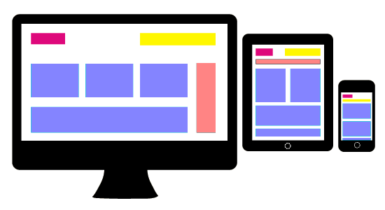
Responsive Web Design (RWD) is a web design approach aimed at crafting sites to provide an optimal viewing experience on screen sizes like desktops, iPads, netbooks, Tablets, Phablets & SmartPhones.
Responsive Websites offer easy reading and navigation with a minimum of resizing, panning, and scrolling—across a wide range of screen sizes.
Our team has gained valuable experience in creating Responsive websites and applications as, in present age, they become norm rather than an exception.
Based on the client requirement all websites and web applications are created that are easy to use on various viewing devices. We use Fluid Grid concept, media queries, and optimize use of server/client side processing to deliver the best possible user experience.
Some recent Responsive websites developed by us are
- http://www.expertgyn.com/
- http://www.cocklakes.co.uk/
- http://www.dradeetigupta.com/
Please visit the Our Work section to see more examples.